5印刷灵感的替代方法
排版是平面设计中的简·布雷迪——它既不会产生色彩的狂热刺激,也不会对浮华的图像嗤之以鼻。但排版不能被忽视——在其基本形式中,它是表达信息的方式,在其真实完整的形式中,它可以用于最佳可读性、影响力,甚至是一种艺术陈述。正是这种完整的形式将其提升为一种艺术形式。
设计社区有大量的排版教程可以帮助你提高技能,但还有其他方法可以帮助和激励你成为一名排版巨人。
混合字体
The ubiquitous Helvetica is everywhere, and while you wouldn’t say it’s overused, there’s something to be said for inviting other fonts to the party. That being said, you don’t want to have a nonsensical hodgepodge of fonts cluttering up the design work-space. FontShop.com’s guide to combing different typefaces will help and recommends fonts according to the mood of the project you’re working on.
进一步的资源:
- 好的网页设计中混合多种字体的7条规则
观看与类型相关的电影
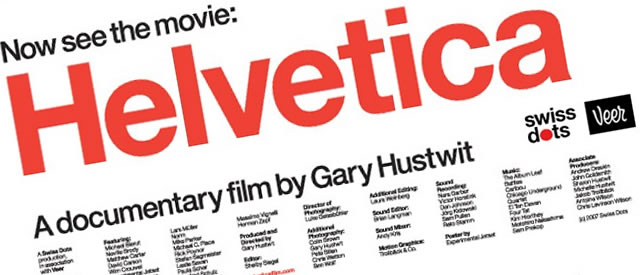
一部关于字体的纪录片?你能相信不止一个吗?几年前发行的《Helvetica》以其对历史的描绘和50年前字体的影响赢得了很多赞誉。这部电影还采访了创造字体的人。
Helevtica电影预览:
《Helvetica》是一部关于排版、平面设计和视觉文化的电影。从一种字体的激增来看,它探索了字体影响我们生活的方式。Helvetica邀请我们再次看看我们每天看到的数千个单词。
与此同时,根据其网站,Typeface是一部新电影,“聚焦于中西部农村的博物馆和印刷店,国际艺术家在这里与退休的工匠见面,共同探索现代设计与传统技术的融合。正如我们所说,放映正在全国乃至世界各地进行。
字体电影预览:
当人们可以把电脑放在口袋里,在街上看电视的时候,Typeface敢于探索一种模拟工艺的黄昏,这种工艺在数字时代给艺术家带来了新鲜的灵感。位于威斯康星州两河的汉密尔顿木制博物馆是文化保护、乡村复兴和美国平面设计血统的化身。在汉密尔顿,国际工匠与退休工匠会面,共同探索现代设计与传统技术的融合。但博物馆的日子可能屈指可数。艺术家和历史学家有什么责任保护一件正在消亡的艺术品?在大零售商为王的不断变化的工业市场中,农村城镇如何生存?
设计自己的字体
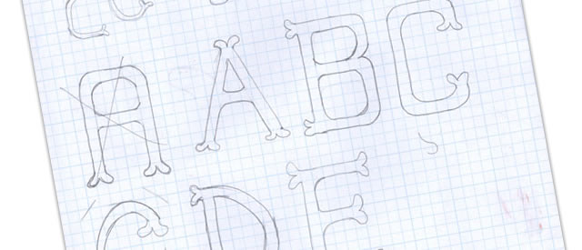
Maybe you’re tired and bored of your font collection? You may have visions of a certain style of the letter “Y”? You could design your own fonts, but a warning: Font-editing programs can range from the cheap, to the expensive. Still, there is something liberating and satisfying to be had from creating that perfect font that’s stuck in your mind.
进一步的资源:
- 如何设计字体:获得灵感
获得灵感–排版无处不在。

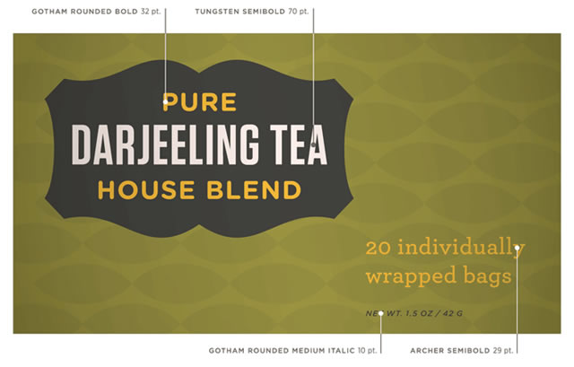
You can find beautiful and inspirational typography where ever you look. Just look around and you will be inspired. Carry a digital camera or a notebook – paper or virtual – with you at all times to capture the inspiration when it hits you. When an advertisement catches your eye, take note of if its type and form. It doesn’t have to be blatant to inspire.
进一步的资源:
- 设计灵感:广告排版
想想最终的结果
A traditional rule of thumb is that serif fonts are for print and sans serif fonts look better on the web (have a look at this article:Serif Fonts Vs. Sans Serif Fonts: A Working Case Study).
一个快速的互联网搜索可以为这两个方面提供支持,但归根结底,只要想想你的个人项目:你的项目是像海报一样大还是像名片一样小?你想要一个极简主义的网站还是一个图形化的网站?打破一些规则,在其他设计师中脱颖而出,尝试最终对你的项目有益的东西。
来源:https://speckyboy.com/five-alternative-methods-for-typography-inspiration/


